What’s In a Cereal Box?
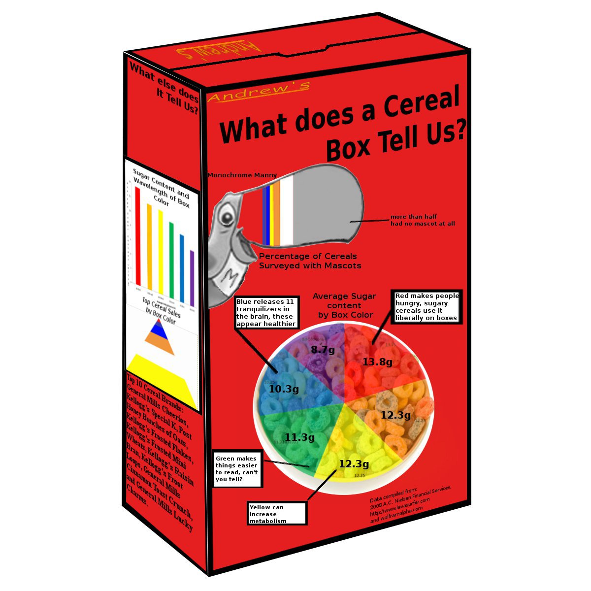
Have you ever noticed that all the sugary cereals use reds and oranges and yellows while the healthy stuff uses blues and purples? Have you ever noticed that the sugar content then becomes a direct proportion with the frequency of the color used on the box of cereal? Ok, yeah, its a stretch to think anybody would come up with this, but this is seriously what I thought of, and its seriously how it happened. So here is an infographic displaying a bit of the data that I came up with when I compiled lists of the top 15, along with a few other cereals. I actually still have data charts mocked up in Excel (read: Google spreadsheets, because its better) if you want even more proof.
Background: Once upon a time I was tasked with making an infographic. The request came from a teacher for whom I actually had a lot of respect so I wanted to put in a mild bit of effort and do something out of the ordinary. With no brilliant concepts ready to be realized, I ventured to the cafe for some cereal. Halfway through my first bowl, it hit me like an over sized mountain of coco puffs hitting ceramic and metal when the dispenser is feeling too generous (you know you’ve been there).
Here’s the full size picture if you wanted to see all the nitty-gritty details: Sugar Cereal Infographic
 Follow